
反設計也要有規則:醜得有策略
故意不精緻可以很潮——但要統一『不精緻』的規格。
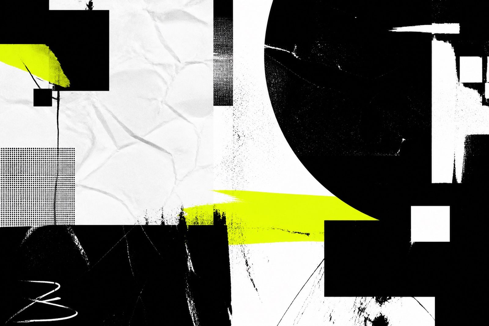
Anti-design 挑戰模板美學:不對稱、硬邊、刺眼對比。真正高手會把這些『錯誤』規格化。
定三條規則就夠:邊框粗細、字級跳躍、允許的酸色數量。超過就變亂。
適合創意工作室、音樂、活動頁;不適合醫療與金融核心流程。
用在 Campaign 期間比用在常駐官網更安全——潮流來得快,也退得快。
Anti-Design With Rules: Ugly on Purpose
Anti-design pushes against template polish: asymmetry, hard edges, sharp contrast. Pros turn those ‘mistakes’ into rules.
Three rules are enough: border weight, type jumps, and how many acid colors you allow. More becomes mess.
Fits creative studios, music, and event pages — not healthcare or finance core flows.
Safer as a campaign skin than a forever homepage — trends arrive fast and leave faster.