非對稱編輯格:讓畫面「呼吸」而不是置中堆疊
精品雜誌與時尚電商最愛的斜向張力——如何用偏移格線做出當代感。
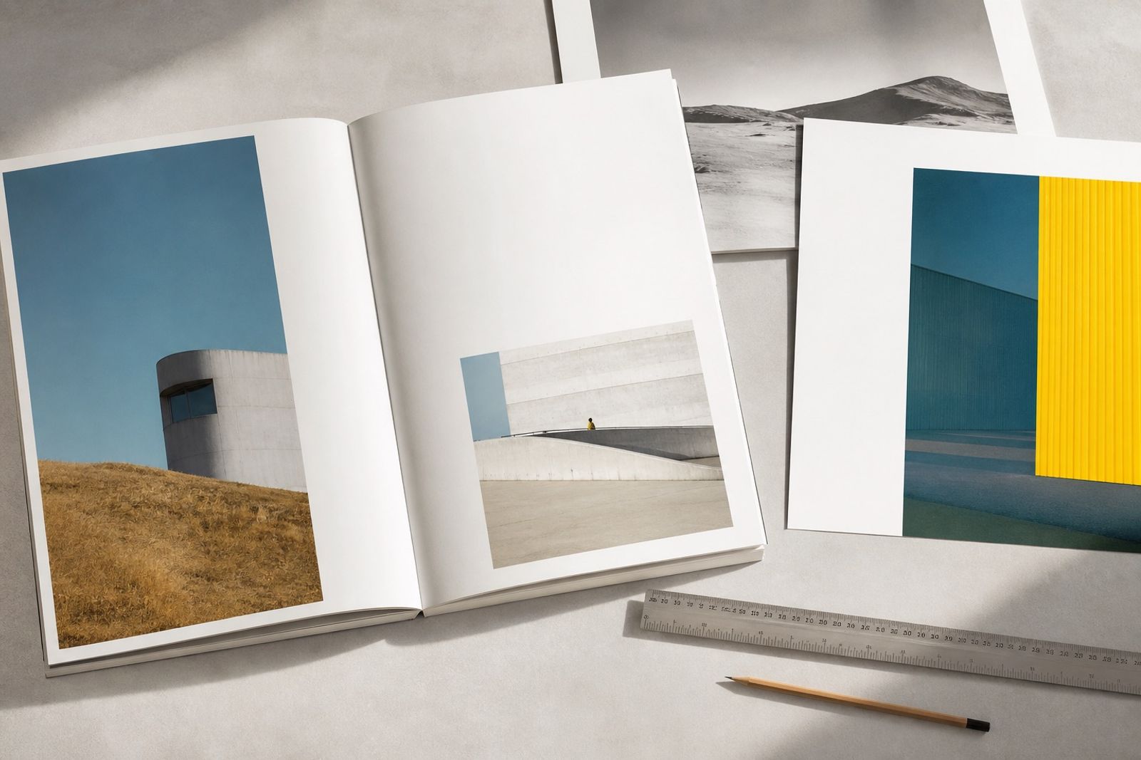
對稱很安全,但容易「平」。非對稱編輯格把主視覺壓到一側,另一側留給標題或留白,讓視線有路徑可走。
實務上可用 12 欄格:影像佔 7 欄、文字佔 4 欄、中間留 1 欄氣口。手機則改成影像在上、文字在下,但維持左對齊與右側呼吸。
國際案例常見於歐美時尚電商首屏:大圖不置中,CTA 貼近字塊而非漂浮在圖中央,整體更像雜誌跨頁而不是 Banner 樣板。
注意:非對稱不是隨便歪。偏移要可量測(例如左緣對齊 8.3%),並在全站重複同一規則,才會形成品牌節奏。
Asymmetric Editorial Grids: Let the Layout Breathe
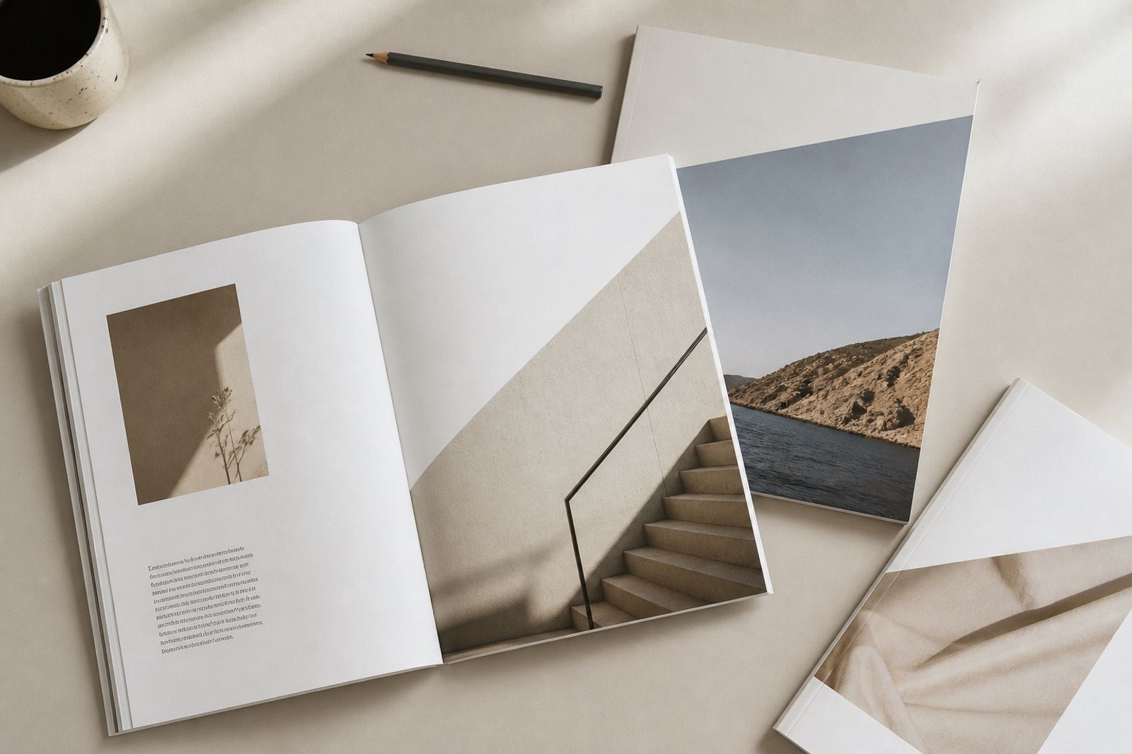
Symmetry is safe — and often flat. An asymmetric editorial grid pushes the hero to one side and leaves the other for type or air, so the eye has a path.
In practice: a 12-column grid with imagery on 7, type on 4, and a 1-column breath in between. On mobile, stack image then type, but keep left alignment and right-side air.
You’ll see this on Western fashion ecommerce heroes: the big shot isn’t centered, and the CTA sits with the copy block — more magazine spread than banner template.
Asymmetry isn’t randomness. Offsets should be measurable (e.g. left edge at 8.3%) and repeated sitewide so they become brand rhythm.