
奶油黃時刻:樂觀色怎麼用才不幼稚
從時尚到包裝,奶油黃成為2025–26的情緒提振色。
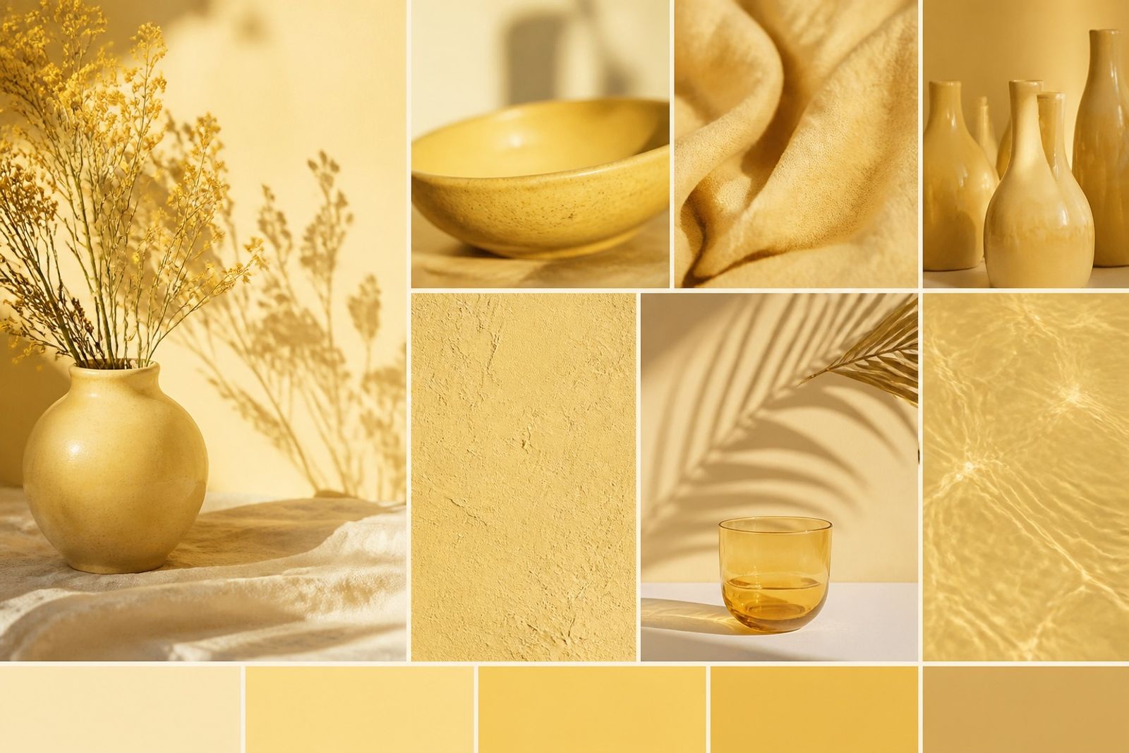
奶油黃比螢光黃更接近『陽光』,適合作為點綴或季節主視覺,而不是整站底色。
建議佔比 10–25%。大面積時搭配米白與深墨,避免甜膩。
美妝、餐飲、兒童友善品牌與夏季 Campaign 特別好用。
印刷注意:螢幕上的黃偏亮,輸出前用實物色票對稿。
Butter Yellow Moment: Optimistic Without Looking Juvenile
Butter yellow feels closer to sunlight than neon yellow — strong as accent or seasonal hero, not a full-site fill.
Aim for 10–25%. On large fields, pair with chalk and deep ink to avoid sugariness.
Beauty, F&B, family-friendly brands, and summer campaigns thrive here.
Print note: screen yellow runs hot — proof with physical chips.