
哥本哈根冷藍:北歐藍調的品牌溫度
霧藍、鋼藍、海軍藍——用冷色做出乾淨可信,而不是冰冷無感。
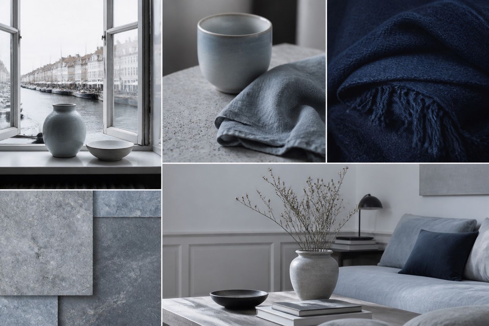
北歐藍調的關鍵不是「夠藍」,而是灰度剛好:霧藍帶灰,海軍藍帶一點綠,避免電子螢幕那種刺眼純藍。
適合金融科技、健康、永續與家居品牌。主色建議用 Harbor 或 Navy Depth;Fog/Cloud Seam 做大面積底,Steel Mist 做分隔線與圖標。
暖一點的方法:在攝影裡加入橡木、羊毛或陶瓷,而不是把藍色調成紫色。材質溫度比色相偏移更自然。
國際案例:哥本哈根與斯德哥爾摩的設計機構網站,常用這組冷藍搭配大量留白,傳遞「清楚、可依賴」。
Copenhagen Cool Blues: Nordic Temperature for Brands
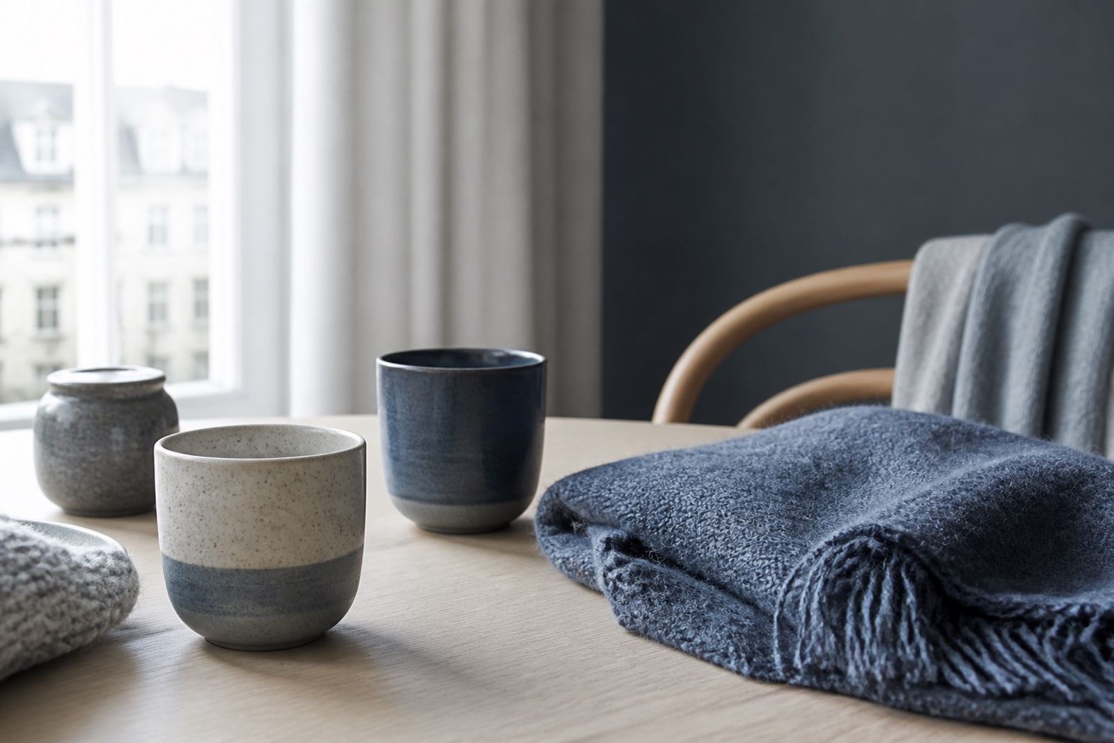
Nordic blues aren’t about ‘bluer’ — they’re about the right gray. Fog blues carry ash; navies tip slightly green. Avoid pure screen blue that stings.
Strong fit for fintech, health, sustainability, and home. Lead with Harbor or Navy Depth; Fog/Cloud Seam for large fields; Steel Mist for rules and icons.
To warm it up, add oak, wool, or ceramic in photography — don’t purple-shift the blue. Material temperature beats hue drift.
Design studios in Copenhagen and Stockholm often pair this cool set with generous whitespace to signal clarity and trust.