
珊瑚復燃:活力色的成熟版
珊瑚橘粉比純橘更柔,適合作為行動號召。
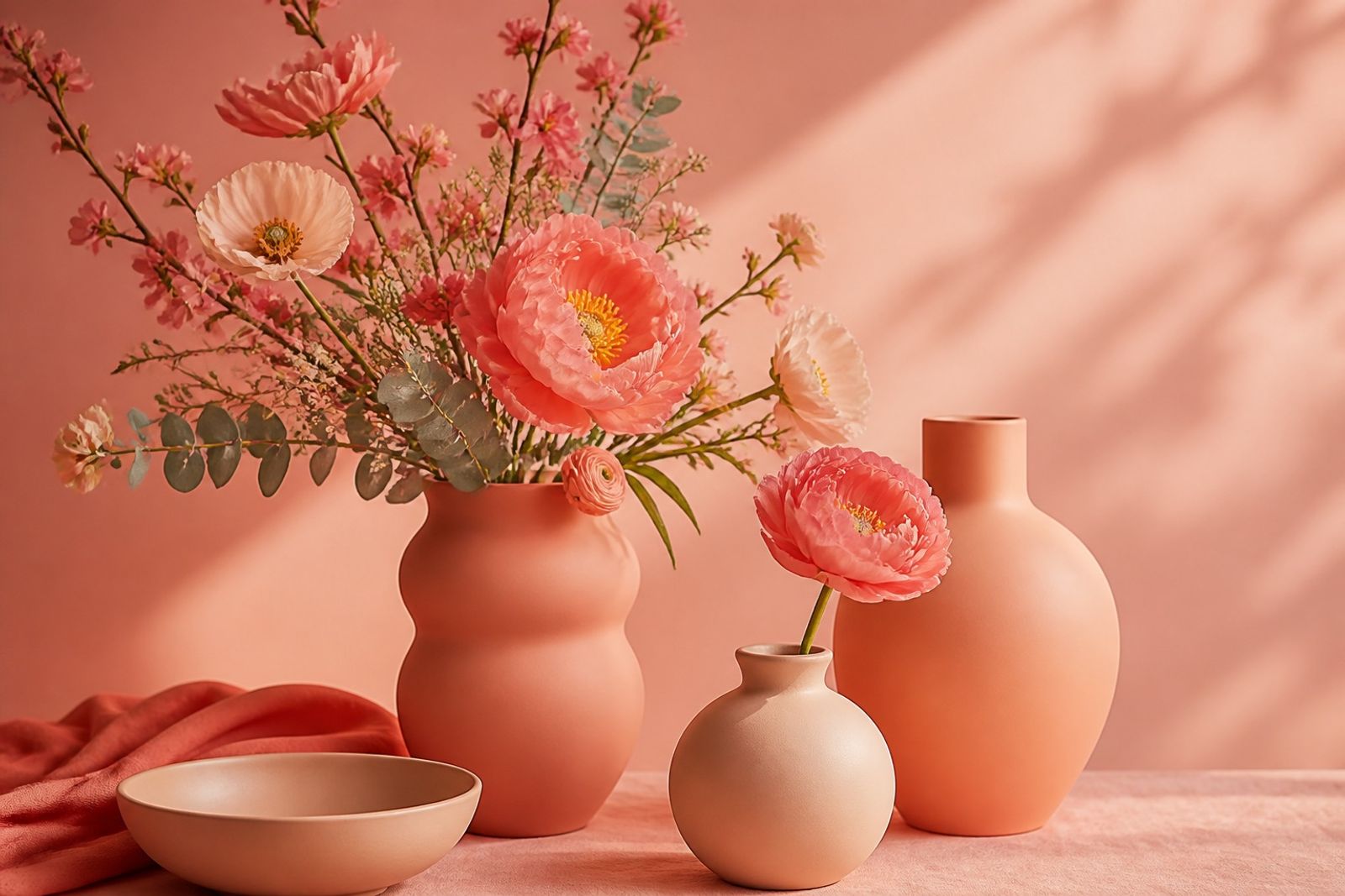
珊瑚系帶樂觀情緒,又比螢光橘更耐看,適合作 CTA 與季節主色。
與米白、深炭搭配清楚;與奶油黃並用要小心過甜。
美妝、健康、旅遊與會員活動頁常用。
色盲友善:不要只靠珊瑚傳達錯誤狀態,另加圖示。
Coral Optimism: Energy With Maturity
Coral reads optimistic without neon-orange fatigue — great for CTAs and seasonal leads.
Clear with pearl and charcoal; careful pairing with butter yellow or it goes sugary.
Common in beauty, health, travel, and membership campaigns.
Color-blind friendly: don’t encode errors in coral alone — add icons.