
沙漠暮色漸層:溫暖過渡取代霓虹
沙、陶、桃、暮紫——用自然過渡做品牌氣氛。
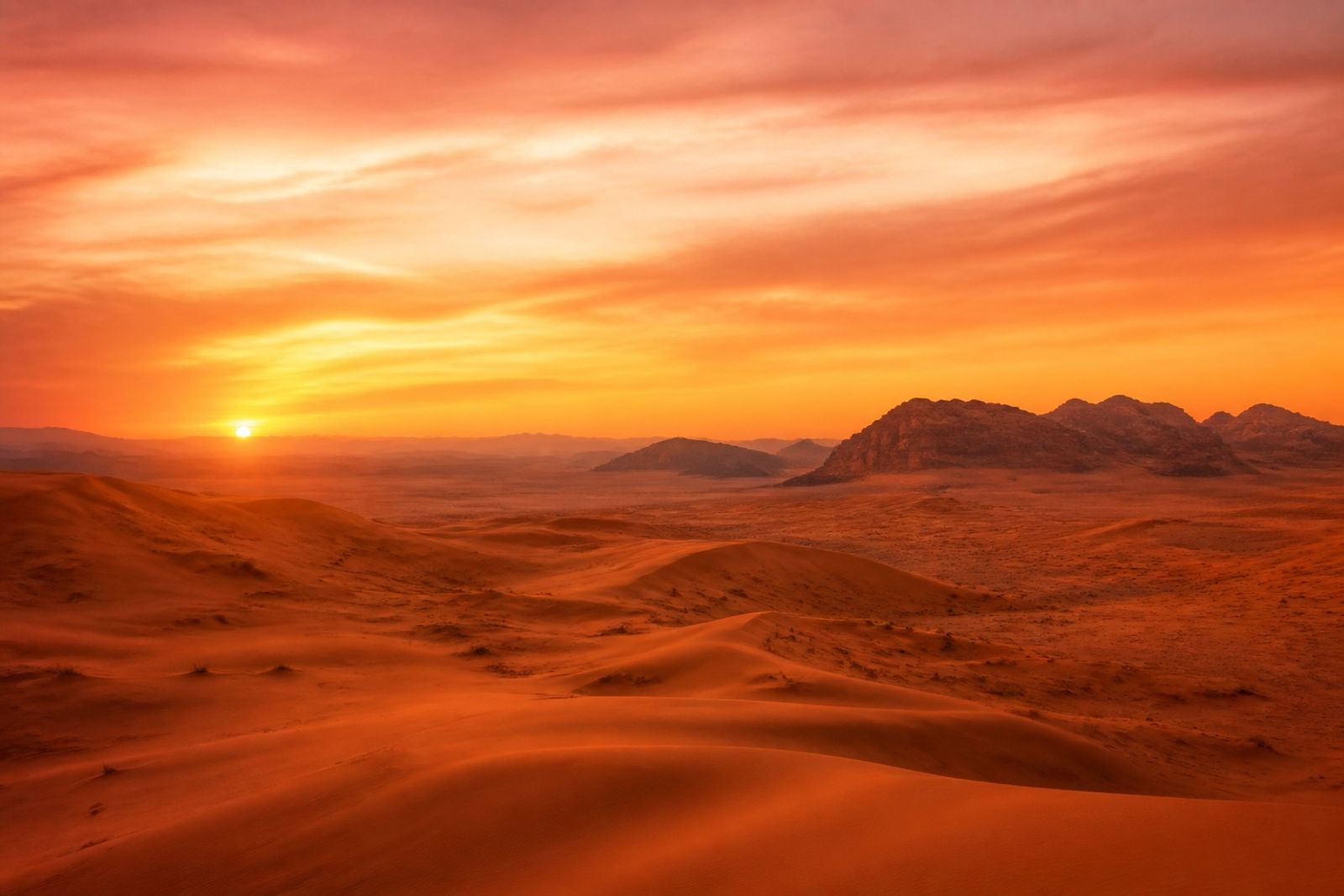
暮色漸層在社群封面與 App 啟動頁很常見,比霓虹更耐看。
漸層方向單一(上亮下暗或左暖右冷),不要多段彩虹。
旅遊、美妝、香氛與夜間活動預熱都很適合。
文字放在暗部或加半透明底,確保對比。
Desert Sunset Grades: Warm Transitions Over Neon
Sunset grades show up on social covers and app launches — more durable than neon.
One direction only (light-to-dark or warm-to-cool) — no rainbow stacks.
Travel, beauty, fragrance, and night-event teases fit well.
Park type on the dark side or a soft scrim for contrast.