
編輯式等寬字:科技感不必靠霓虹
等寬字從開發者工具走進品牌敘事,冷靜又當代。
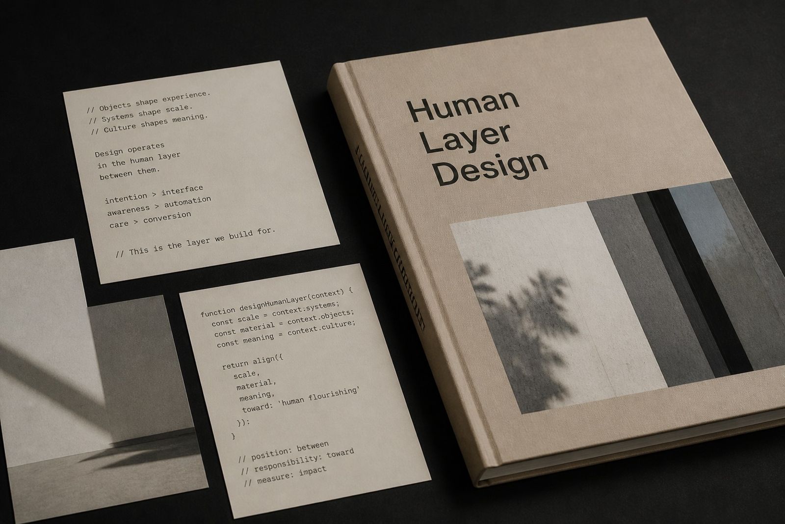
等寬字被用來標註規格、時間戳、版本號與『真實感』旁白,形成科技編輯語氣。
不要大段正文用等寬;當 Caption/Label 最合適。搭配無襯線正文即可。
硬體、軟體、汽車與實驗性時尚都在用這套符號。
注意字距與行長:等寬在窄欄更易讀,寬欄會顯散。
Editorial Monospace: Tech Tone Without Neon
Monospace now marks specs, timestamps, versioning, and ‘realness’ asides — a tech-editorial voice.
Don’t set long body in mono; use it for captions/labels beside a sans body.
Hardware, software, auto, and experimental fashion all borrow this code.
Watch tracking and measure: mono reads better in narrow columns.