
米蘭春夏:柔礦物配色怎麼落地到品牌
從 runway 到包裝,這組低飽和礦物色如何在社群與電商版面保持高級感。
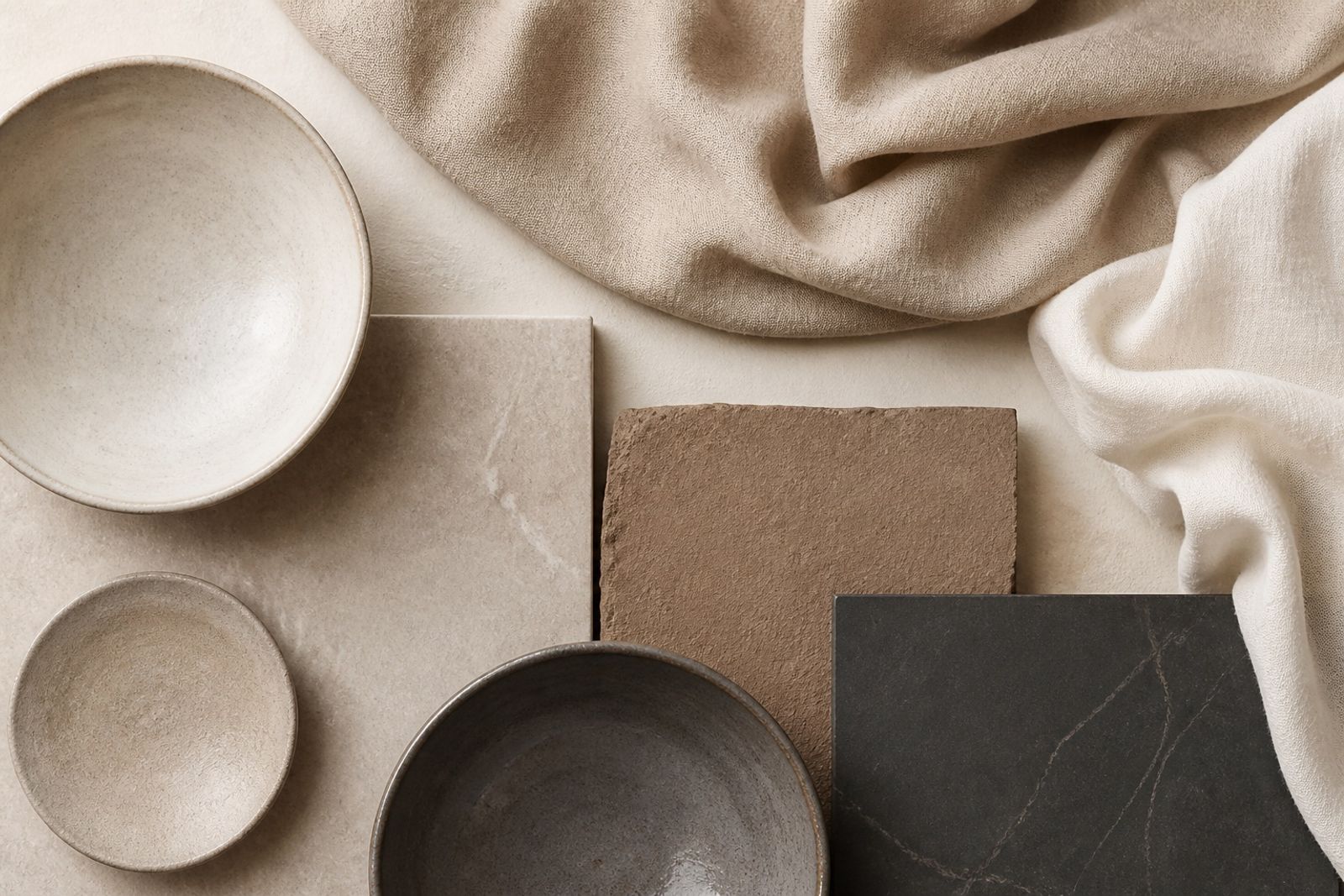
今年米蘭與巴黎的春夏形象,反覆出現一組「柔礦物」色:粉石灰、砂岩、陶土、石墨與亞麻。它們不靠高飽和搶眼,而是靠層次與材質感說話。
對品牌來說,這組色適合用在:產品硬照背景、包裝襯底、以及 Reels 轉場底色。關鍵是讓其中一色當主色(通常是 Sandstone 或 Clay),其餘只做輔色與文字對比。
落地建議:主視覺 60% 用 Chalk/Linen 留白;20% Sandstone 承載產品;15% Clay 做 CTA 或標籤;5% Graphite 做字級層級。
國際案例參考:不少北歐家居與日系護膚品牌已用類似比例經營長期視覺,重點不是跟風同色,而是固定比例與材質光澤。
Milan SS: Soft Mineral Palettes for Brand Work
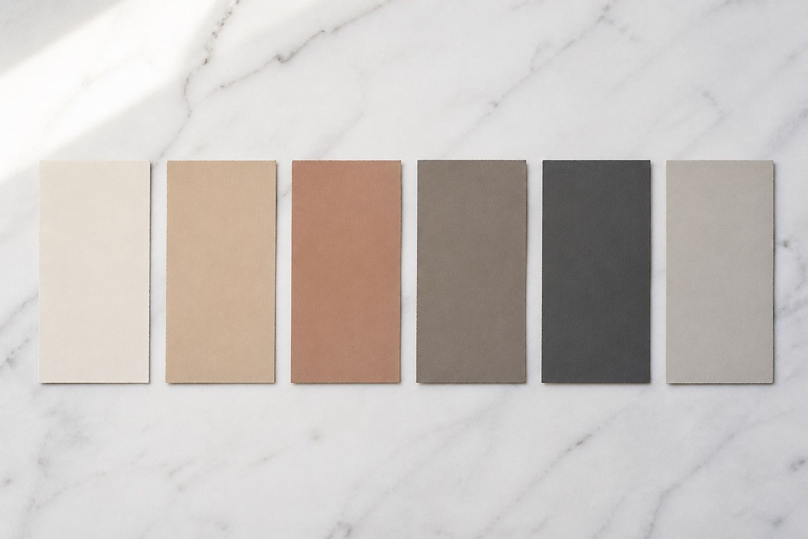
Milan and Paris SS imagery keeps circling a soft mineral set: chalk, sandstone, clay, graphite, and linen. The impact comes from layers and material feel — not loud saturation.
For brands, this set works on product stills, packaging liners, and Reels transition beds. Pick one lead (usually Sandstone or Clay) and keep the rest as support and type contrast.
Practical split: ~60% Chalk/Linen for air; 20% Sandstone under the product; 15% Clay for CTAs or tags; 5% Graphite for hierarchy.
Nordic home and Japanese skincare brands run similar ratios over long campaigns. The win isn’t copying hex codes — it’s locking proportion and finish.