
新粗野主義網頁:粗邊框與大聲排版
硬邊、高對比、少量酸色——用「不精緻」做出記憶點,但仍要可讀。
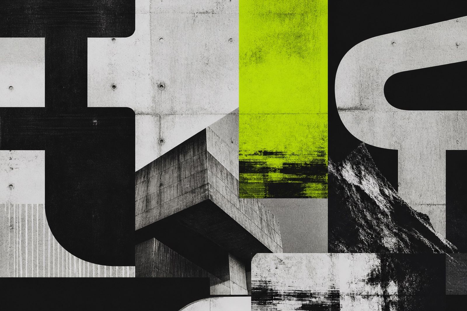
新粗野主義不是亂:粗黑框、幾乎無圓角、超大標題、功能按鈕長得像實體按鍵。它挑戰的是過度精緻的 SaaS 審美。
可用於作品集、創意工作室、活動頁與實驗性電商。正文仍需足夠行高與對比,否則「有態度」會變成「看不清」。
酸綠/橙紅只做 CTA 或標籤;大面積維持黑白。動效宜短促、線性,少用彈性彈跳以免顯得玩具感。
國際獨立站與設計獎網站常以此建立辨識度——記得先服務內容,再談叛逆造型。
Neo-Brutalist Web: Thick Borders and Loud Type
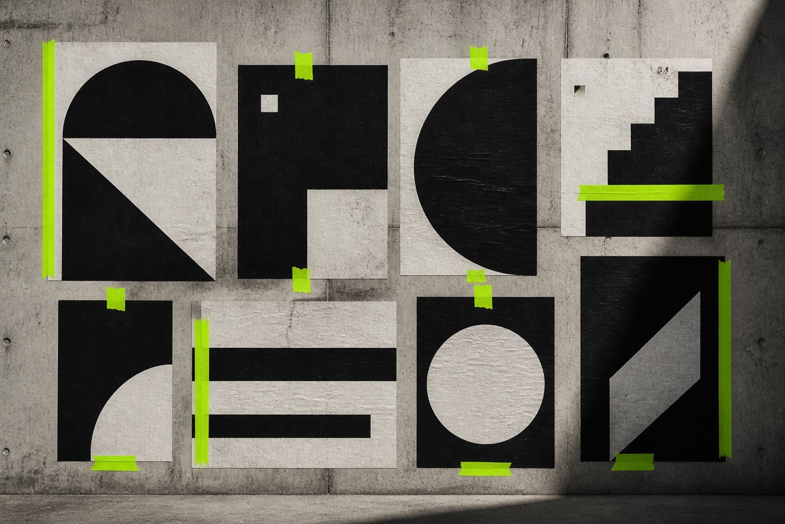
Neo-brutalism isn’t chaos: thick black borders, almost no radius, oversized titles, buttons that feel like physical keys. It pushes back on over-polished SaaS gloss.
Great for portfolios, creative studios, event pages, and experimental shops. Body type still needs leading and contrast — attitude without readability just fails.
Acid green or signal orange only for CTAs/tags; keep large fields black/white. Motion should be short and linear — skip bouncy easings that feel toy-like.
Indie sites and award galleries use this for recognition — serve the content first, then the rebellious frame.