
Quiet Luxury 的字級節奏:從 Display 到 Caption
少裝飾、強層級——用字級與字重做出高級感,而不是堆特效。
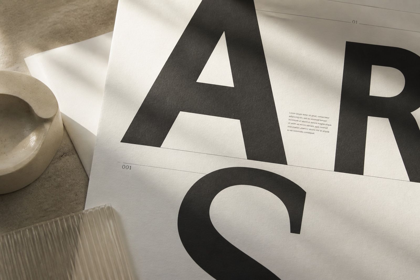
Quiet luxury 視覺不是「更灰」,而是更克制的層級。Display 與 Body 之間至少拉開兩級字級,字重也要有明顯差(800 vs 400),Caption 則用較緊的行高承載輔助資訊。
字型選擇上,無襯線幾何體適合數位品牌;若要偏編輯感,可在標題偶發使用襯線,但正文維持同一家族,避免整頁像拼貼。
前沿美學趨勢:品牌站更常把大標拆成兩行短句,並用極細 hairline 或柔和漸層當背景氣氛,而不是厚重陰影與圓角卡片牆。
實作時先定四階字級,再決定顏色與間距;順序反了,很容易變成「每個區塊都在喊」。
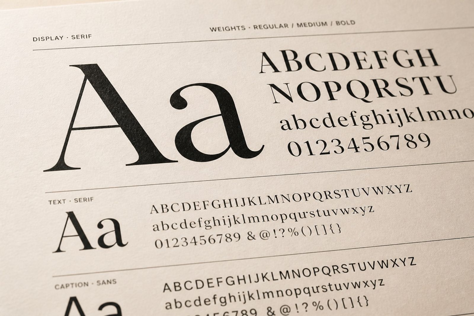
Quiet Luxury Type Rhythm: Display to Caption
Quiet luxury isn’t ‘more gray’ — it’s restrained hierarchy. Keep at least two steps between Display and Body, with a clear weight jump (800 vs 400). Captions carry supporting info on a tighter leading.
For digital brands, a geometric sans works cleanly. Want a more editorial tone? A serif can appear in titles — but keep body in one family so the page doesn’t feel collage-like.
Brand sites increasingly split heroes into two short lines, using hairlines or soft gradient atmosphere instead of heavy shadows and card walls.
Lock a four-step type scale before color and spacing. Reverse that order and every block starts shouting.