
Quiet Maximalism:克制地堆出豐富感
不是極簡,也不是爆滿——用材質層次取代裝飾噪音。
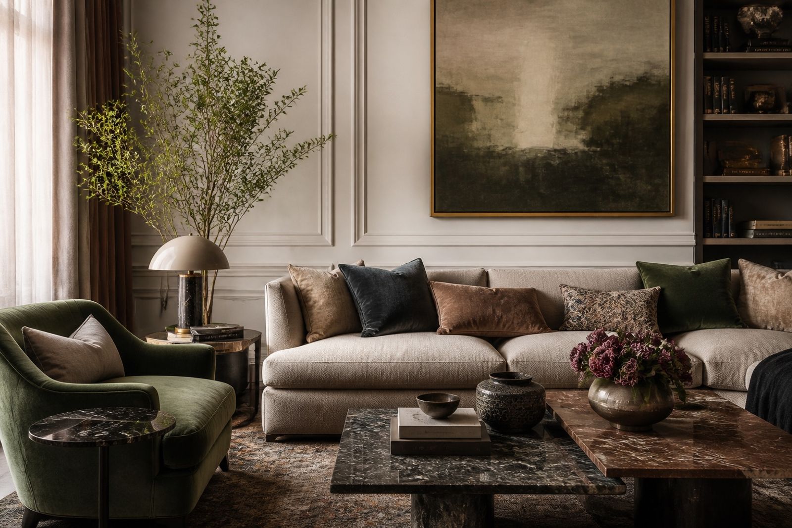
Quiet maximalism 正在取代純白極簡:保留呼吸感,但用絨面、石材、金屬與織物質地堆疊深度。
品牌落地時,先定一個安靜的主色場,再只加 2–3 種觸感對比。標題保持克制,讓材質照片說話。
2025–26 精品與家居內容大量使用這套語言:看起來「有東西」,卻不會搶走產品本身。
避免把每寸畫面都填滿。留白仍是結構,材質才是內容。
Quiet Maximalism: Rich Layers, Still Calm
Quiet maximalism is replacing pure white minimalism: keep air, but stack velvet, stone, metal, and textile depth.
For brands: lock a quiet field color, then add only 2–3 tactile contrasts. Keep headlines restrained and let material photos talk.
Luxury and home content in 2025–26 uses this a lot — it feels full without stealing the product.
Don’t fill every inch. Whitespace is structure; material is the message.