
數位襯線復興:標題也可以很有溫度
襯線不再只屬於印刷——品牌站標題正在重新變『有人味』。
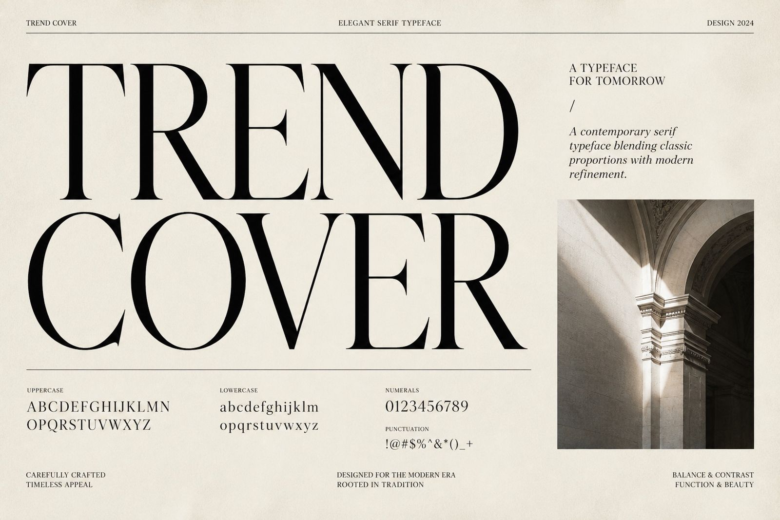
無襯線統治數位十年後,襯線標題回流:用來表達工藝、編輯感與信任。
常見做法:Display 用襯線,Body 維持無襯線。不要整站換襯線導致閱讀疲勞。
美妝、出版、餐飲與精品最吃這套;SaaS 可只在故事頁使用。
選字時避開過度裝飾的書法體,選現代襯線家族,螢幕上才夠清。
Digital Serif Revival: Warmth in the Headline
After a decade of digital sans dominance, serif headlines are back for craft, editorial tone, and trust.
Common split: serif for Display, sans for Body. Don’t serif the whole site and tire readers.
Beauty, publishing, food, and luxury love this; SaaS can reserve it for story pages.
Skip overly decorative scripts — modern serif families stay clearer on screens.