
柔陶土色:手作溫度的品牌中性色
陶土橘棕回到包裝與電商背景,帶手作可信度。
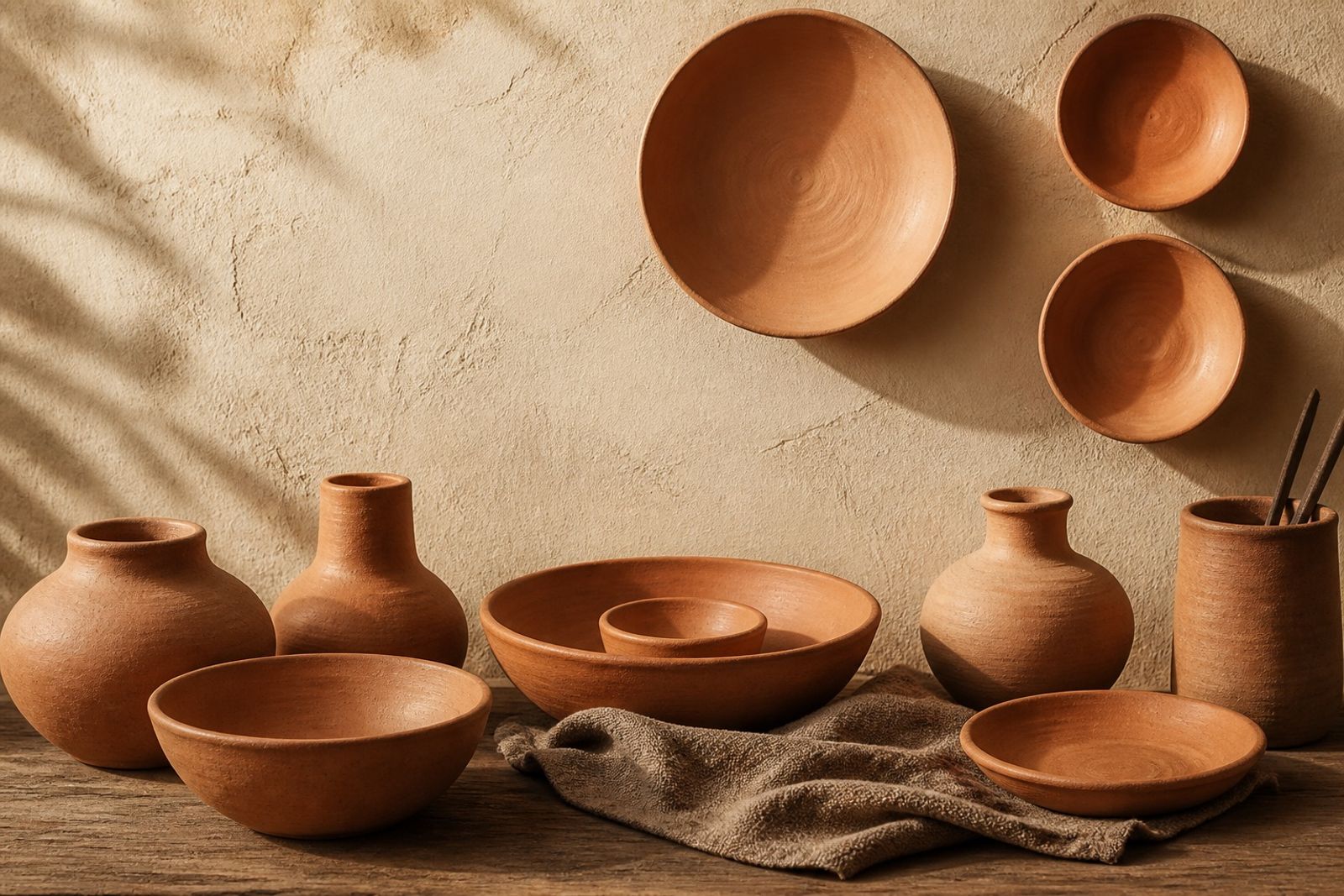
陶土色讓數位介面看起來更『摸得到』,適合手作、餐廚與生活方式。
比純橘更沉,比咖啡棕更有陽光。
與亞麻、原木攝影一起出現效果最好。
UI 按鈕可用深窯棕,避免淺陶土上放淺字。
Soft Clay Terracotta: Handmade Warmth as Neutral
Clay makes digital UI feel touchable — strong for craft, kitchen, and lifestyle.
Deeper than pure orange, sunnier than coffee brown.
Best with linen and raw wood photography.
Buttons in kiln brown; don’t set light type on light clay.