
柔玻璃擬態回潮:透,但不要吵
霧面玻璃、低對比模糊——用在卡片與導覽,而不是整頁特效牆。
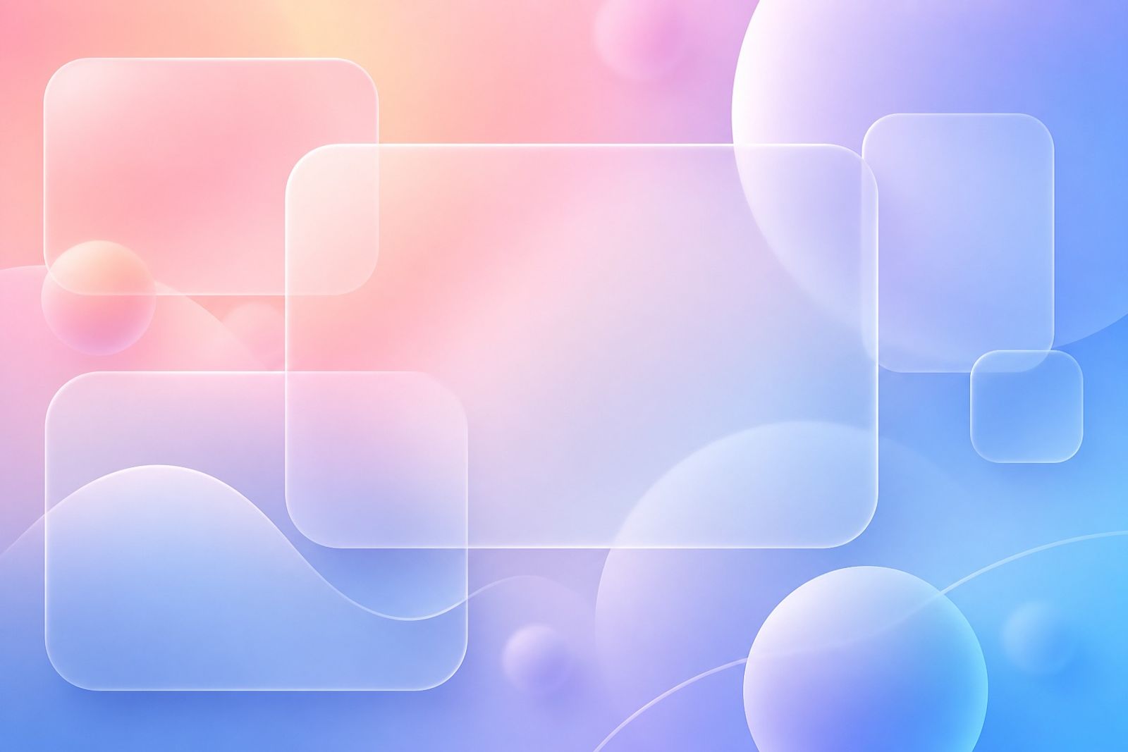
早期 glassmorphism 常過度飽和。現在的回潮版本更淡:低透明度、細邊框、背景只做氣氛。
適用於定價卡、功能浮層與手機導覽。正文區仍用實底,確保可讀性。
與柔漸層、Quiet Luxury 很合拍;與高對比粗野主義則容易打架。
實作提醒:減少即時模糊層數,優先用預先輸出的霧面材質圖,效能更穩。
Soft Glassmorphism Is Back — Translucent, Not Loud
Early glassmorphism was often too loud. The return is quieter: lower opacity, thin borders, background as atmosphere only.
Use it for pricing cards, feature sheets, and mobile nav. Keep reading surfaces solid for clarity.
Pairs well with soft gradients and quiet luxury; clashes with high-contrast brutalism.
Performance tip: fewer live blur layers — prefer pre-rendered frosted textures.