
柔漸層氣氛:用光感取代厚重陰影
2025–26 品牌站趨勢:薄漸層與霧面質感,讓首屏像空氣而不是卡片牆。
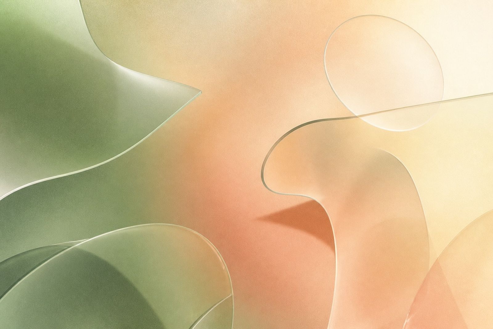
厚重多層陰影曾是「高級感」捷徑,現在反而顯舊。取而代之的是低對比柔漸層:兩到三色慢速過渡,搭配細顆粒,營造空氣感。
落地時避免彩虹漸層。選相鄰色相(例如鼠尾草綠 → 蜜桃 → 奶油),透明度 8–18%,放在 hero 或區塊背景,內容文字仍維持高對比。
與攝影搭配時,漸層色應呼應產品主色的 20–30% 飽和度,讓畫面像同一場景,而不是貼上濾鏡。
小提醒:漸層是氣氛,不是主角。一旦標題可讀性下降,就應立刻減弱或改用純色留白。
Soft Gradient Atmosphere: Light Instead of Heavy Shadows
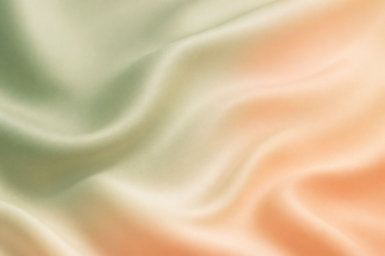
Heavy multi-layer shadows used to read as ‘premium’ — now they often feel dated. Soft, low-contrast gradients take their place: two or three hues easing into each other with fine grain.
Skip rainbow meshes. Pick neighboring hues (sage → peach → cream), keep opacity around 8–18%, and park them behind heroes or sections while type stays high-contrast.
When pairing with photography, echo the product’s lead color at 20–30% saturation so the frame feels like one scene — not a stickered filter.
Gradients are atmosphere, not the star. If readability slips, dial them back or return to flat whitespace.