
東京夜色:霓虹點綴色怎麼用才不俗
洋紅、電青、靛藍——把夜城高飽和色收成品牌點綴,而不是整頁尖叫。
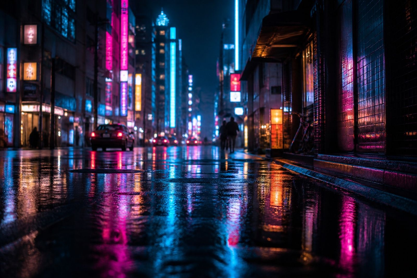
東京夜景的張力來自「大面積暗色 + 少量高亮」。品牌若整頁鋪滿霓虹,會像夜店傳單;正確用法是 80% 深底,12% 中性靛,8% 高亮點綴。
CTA、數字或活動標籤可用 Neon Magenta/Electric Cyan;正文與長段落維持淺灰或米白,確保閱讀。
攝影搭配:濕地反光、玻璃與金屬高光,能讓霓虹色看起來高級。若產品本身已很跳,背景改用 Night Ink,不要再疊第二層霓虹。
國際電玩、球鞋與夜間活動視覺常用這套邏輯——高亮是信號,不是塗料。
Tokyo Nights: Neon Accents Without Looking Loud
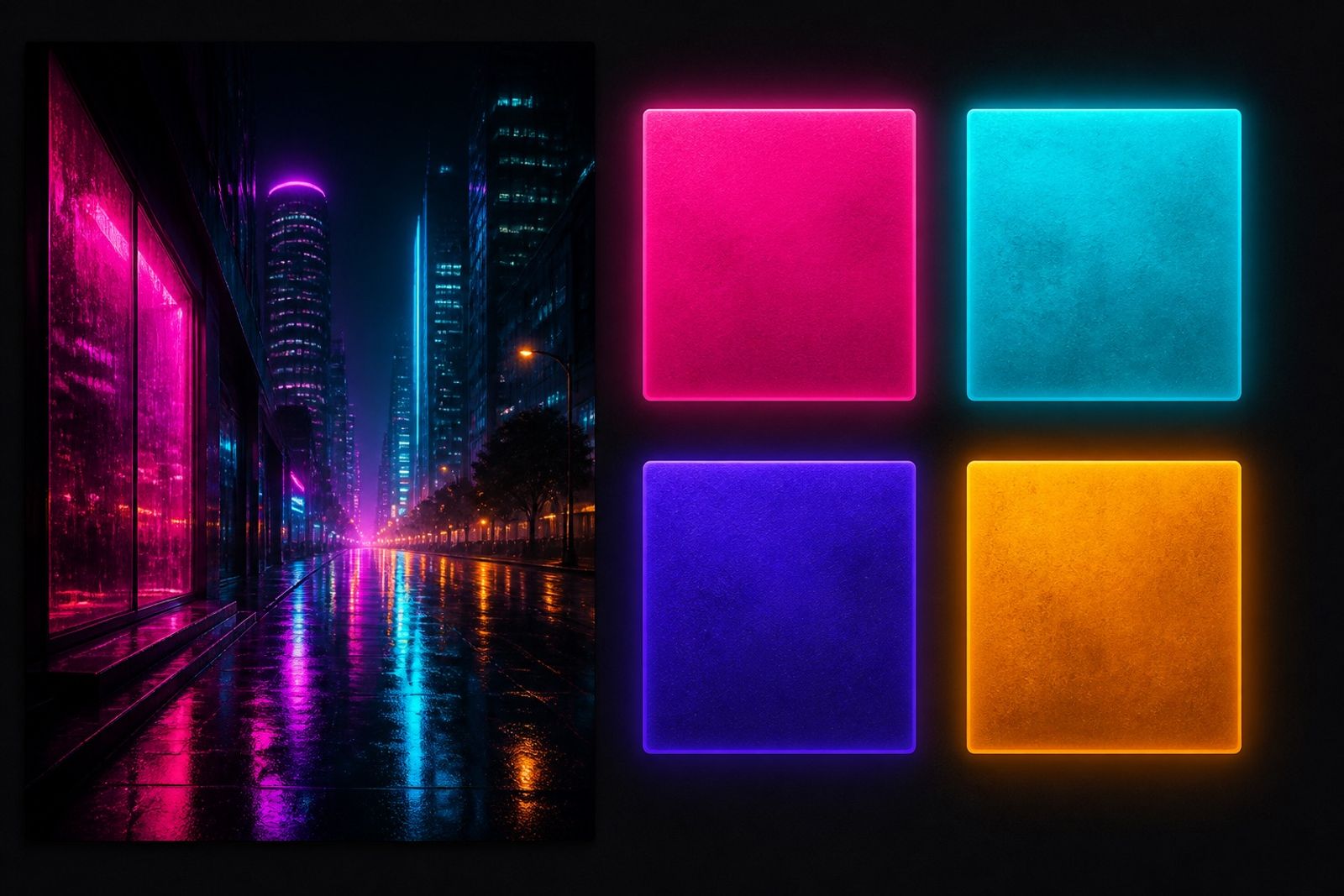
Tokyo night energy is ‘lots of dark + a little glow.’ Flood a page with neon and it reads like a club flyer. Aim for ~80% deep base, 12% indigo mid, 8% hot accent.
Use Neon Magenta or Electric Cyan on CTAs, stats, or event tags; keep long copy in soft gray or off-white for reading.
Photography tip: wet reflections, glass, and metal highlights make neon feel premium. If the product is already loud, park it on Night Ink — don’t stack a second neon field.
Gaming, sneaker, and nightlife visuals worldwide follow the same rule: glow is a signal, not paint.